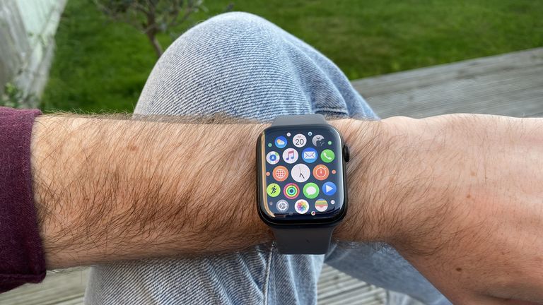
Welcome to the second part of T3’s in-progress Apple Watch Series 5 review, which looks at its software and performance.
In part one of the Apple Watch Series 5 review, I took a look at the design (especially the new titanium body), and the new always-on screen. Tomorrow, I’ll talk about its health and activity features.
Then we’ll finish with the final verdict and score, and a place in our best smartwatches guide.
APPLE WATCH SERIES 5: PERFORMANCE
The Apple Watch Series 5 has a new processor, called S5, that replaces the S4 used in the Apple Watch Series 4 (see if you can crack that naming code).
But despite the processor having changed enough for Apple to give it an updated name, don’t expect to notice any difference from it: the new features are all about efficiency, rather than extra speed.
The changes are all focused around things like the addition of the low-power controller for the always-on screen, and other ways of saving power to balance out the extra energy usage.
The good news is that the Apple Watch didn’t actually need any extra speed, so I’m fine with this – I never found myself bottlenecked by the Series 4 when loading an app itself (though sometimes when fetching data within apps, but that’s more of a wireless responsiveness thing).
So while it would be nice to feel like we’re getting a new transformative speed boost, it’s just the same speed, which is: more than fast enough.
I just mentioned wireless performance and data loading within apps, and I have noticed an improvement there when using the Series 5, but it’s hard to say how much of that is down to hardware – watchOS 6 could be adding improvements. But I think the fact that I’m using it with an iPhone 11 Pro helps.
One of Apple’s tweaks in the new iPhone is an extra Bluetooth antenna for improved range. And I’ve seen a significant improvement in connectivity between the watch and phone in a way that is, admittedly, quite specific to me – but that is a good sign generally.
I cycle to work with my iPhone in a waterproof backpack (because England), which is made from a material so robust, it stops my iPhone XS and Watch Series 4 from communicating over the three feet between them. (My own water-sack body being in the way will not have helped.)
But since testing the Series 5 and iPhone 11 Pro, the connection is maintained. As I say, I think the iPhone is doing the heavy lifting here, but since you actually notice the improvement on the Watch, I think it’s worth noting here.
APPLE WATCH SERIES 5 REVIEW: BATTERY LIFE
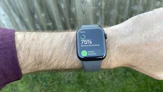
Okay, we’ve talked about the S5 chip being geared towards energy-saving, so does it overcome the extra draw of the screen?
The answer, oddly, is both yes and no. Battery life here exceeds Apple’s claims, as it has for the last few Apple Watch models, but not by as much as the Series 4 managed.
Apple claims an 18-hour battery life, which is effectively a day of use before sleep, and is what it said for the Series 4. This assumes a mid-level use case of doing some working out and GPS usage (which are big power drainers), but mostly using it for notifications and bit of Siri here and there. Very typical, and very similar to my own usage.
With Series 4, I was taking it off at bed time with 50-55% power left. If I was away from a charger, I was always fairly confident of getting through two days with it (though sometimes it fell a couple of hours short).
So far, the Series 5 has been at more like 35% at the end of the day. Still plenty left to get me through that specific day, but I won’t be confident of leaving the charger overnight any more.
That said, you can turn off the always-on display, making the Series 5 just like all previous Apple Watches, and reclaiming battery life. If you know you’re going to be in a situation without easy charging, this is a handy option to have around.
So yes, Apple’s battery life claims are very comfortably met, but the always-on screen is still bringing the total life down compared to its predecessor.
The Apple Watch has always been quite fast to charge, which is a bonus – it’s really easy to top it up while you’re in the shower or something like that.
However, the Watch comes with a USB Type-A cable in the box, which is a bit frustrating in this day and age. The iPhone 11 Pros and iPad Pros and MacBooks all comes with USB Type-C charging cables, so they can all be juiced from a single type of adapter – perfect for travelling.
But the Watch still comes with the old-fashioned connection, meaning a second adapter is needed. You can buy a USB Type-C magnetic Watch charger, for another £29, but if the high-end iPhone is moving to USB-C, we’re not sure why the Watch hasn’t.
APPLE WATCH SERIES 5 REVIEW: WATCHOS 6
The new version of watchOS brings a solid list of new features, several of which I’ll cover tomorrow in the health and fitness section: cycle tracking, noise level alerts, and activity trends among them.
The other most useful new features are: new watch faces, improved Siri capabilities, and some new apps.
The watch faces are, no surprise, what I’ve spent the most time playing with. Last year, I criticised the range of faces available in watchOS, and I think watchOS 6 is significant improvement… but I still want to see more.
Let’s start with what’s better. Apple has made improvements in two big areas: interesting new faces that feel like they’re taking more advantage of what being digital can do; and making those faces more flexible for what you want to show.
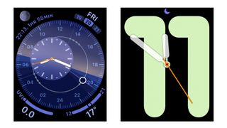
Left: Solar Dial. Right: Numerals Mono
We already have somewhat gimmicky motion faces, but I like things like the new Solar Dial, which shows the movement of the sun in a circle around the face, with an analogue or digital face that moves with it, on the opposite side of the circle.
It’s rich in colour, can fit four complications around the outsides, and can only be achieved in this form on a smartwatch. I probably won’t use it during winter, because it’s depressing to see the sun cross the horizon before I leave the office, but I still think it’s great.
Numerals mono shows an analogue face over a giant set of funky numbers that give you a quick way to see the hour. It’s not for me, but again it’s a fun design that can’t be achieved on a normal watch.
Then there are faces like California and Gradient. Both are impressively flexible – California is quite a traditional look, but it comes in lots of different colours, lets you switch between line markers only or numerals (including a mix of arabic and roman), and you can choose to have it full-screen, or as a circle, with complications around the outside. This one face has so many looks – it’s brilliant.
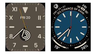
Both these faces are California – I told you it was versatile.
Gradient is simpler in that it just fills the watch face with colour, which spreads from the hands out, and shift hue the further it gets from the hands. It’s a clever effect, and you can choose from a huge range of colours, and again it can full the face on its own, or it can be a circle with complications in the corners.
These are all huge steps in the right directions, but there are still frustrations. Meridian is a new face that’s the most dress watch-like face so far, and I would absolutely use it for fancier occasions, if its only colour options weren’t black or bright white. It needs some nice cream or off-white options – it’s so bizarre to have such an overly limited face right next to the Swiss Army Knife of California.
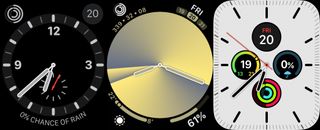
Some of the other watchOS faces I’ve been using, from left to right: Explorer (an older face that looks good on my titanium watch); Gradient (a new watchOS 6 face, in its circle form here); and Meridian (which I still like, I just wish I could tweak more).
But I still want more. I want more designs that go bolder with standard watch elements, and more designs that are totally out there. This watch is a blank canvas, and I don’t feel like the most is being made of that still.
But that’s been my gripe since the first Watch – I’m much happier with the faces on offer this year, and I think it’s easier than every to find something that suits you, especially if you like to tinker.
Siri’s extra capabilities are pretty functional – you can now ask it what song is playing and get an answer, and it can now fetch answers to questions from the web, and give you links to open web pages in a browser right on your little watch screen.
This can be really useful if the answer is in the snippets from the pages that Siri pulls out, but if you have to open the web pages themselves then… well, you know how much crap covers the actual content on the web these days? Now put it on a tiny screen. Yeesh. But hey, it’s an option.

Left: Siri returns a useful website. Right: Tapping on the website proves it is maybe less useful than hoped.
Of the new apps from Apple, the Voice Memos app maybe has the potential to be most useful, especially if you set a shortcut to it from a complication. You can just jump in and start recording notes, if you’ve got something worth saving for posterity. Not everyone is a forensic pathologist or starship caption who needs to log these things, but it could get more people into the habit, and you might like it.
The new Audiobooks app could very handy, assuming you get audiobooks from Apple’s Books store. It syncs between from wherever you last were easily, and you can pick right up.
The Calculator app obviously can also be useful, but a) finding it from the Watch’s tiny bubbles app list when you need it is more hassle than just pulling out your phone (though there is an improved list view for your apps, too), and b) we’re furious Apple didn’t make it look like a classic Casio calculator watch. Instead, it looks like the Calculator app on iPhone. Whatever.
Adding and removing apps has had a big upgrade in watchOS 6 – not only is there an App Store on the device itself, but you can also delete most system apps now too, clearing more clutter.
There are also some invisible improvements for developers that will result in slicker, better apps – especially ones that use audio, such as podcast apps, which will be able to stream audio directly from the internet.
[“source=t3”]
