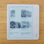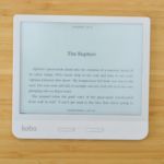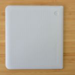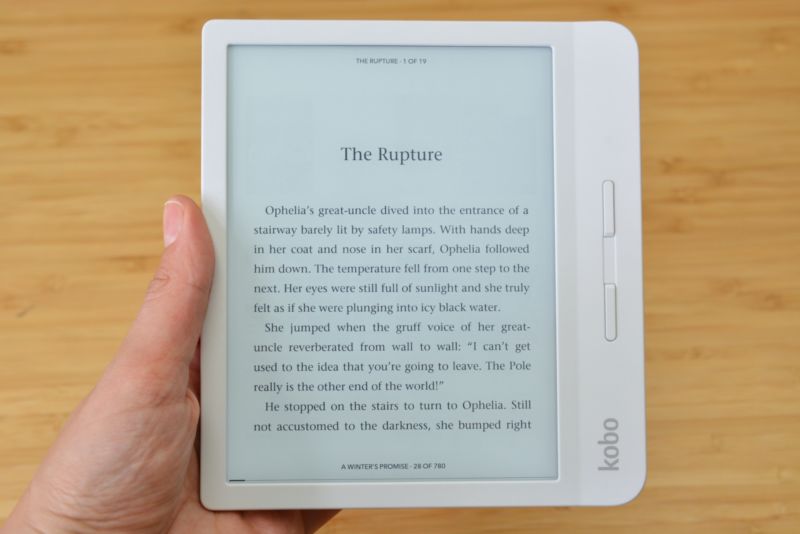
Nearly one year after releasing the Forma e-reader, Kobo returns today with a new slab dubbed the Kobo Libra H2O. The $169 e-reader retains the skeleton of the Forma, but is actually a smaller device. It has a 7-inch, 1680×1264, 300ppi E Ink display, down from the Forma’s 8-inch display, but it has the same side-chin with page-turn buttons. Notably, Kobo moved the power button from the edge of the e-reader to the back of the device, and it’s now a slightly indented circle that’s easy to discern from the device’s slightly textured back.
At 6.7oz, the Libra H2O is also a hair lighter than the Forma, and it comes in both black and white color configurations. In contrast to the Forma, the Libra H2O comes with 8GB of storage (the Forma has 32GB) and it doesn’t use Mobius screen technology, which gives the Forma’s display more durability. But those minor spec differences don’t change the fact that the Libra H2O is basically the Forma’s slightly smaller sibling. So if you liked the Forma’s design, you’ll probably like the Libra H2O.
I’ve used both, and the experience is nearly identical in terms of physicality. I like how comfortable the upturned side-chin is to hold with one hand, I like the convenience of the page-turn buttons, and I like how quickly the E Ink touchscreen switches from portrait to landscape orientation when I flip the device. I also like that I don’t have to charge the Libra H2O for weeks on end—that’s not unique to this device, but it’s a unique feature that E Ink e-readers have that I still gush over. I don’t like that the Libra H2O charges via microUSB, but we’ll probably be waiting a while longer before e-reader manufacturers care enough to make the switch to USB-C (if they ever care to at all).
Helping you read better
Even if its hardware is solid yet ultimately familiar, the Libra H2O shows off Kobo’s new e-reading interface well. These updates are more important than the addition of the Libra H2O to Kobo’s e-reader lineup because the entire device family will be receiving the new reading interface in future software updates. A new “e-reading interface” doesn’t mean that the pages of your digital books will look wildly different—on the contrary, they look quite the same. But Kobo added some extra tools that readers can use while they’re neck-deep in a book to help increase their reading comprehension, or at least that’s the idea behind Kobo’s “reading for understanding” strategy.
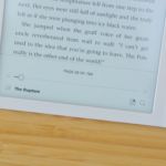
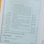
One of the new features comes in the form of an e-book scrubber, which brings up smaller page previews that sit atop the current page you’re reading. The scrubber also lets you navigate through those smaller pages to any point in the book. Kindle users will be familiar with this feature, although it looks particularly nice in action on a device with a larger screen.
Those with Kobo Forma or Libra H2O devices (and decent eyesight) could feasibly read those smaller pages in their entirety thanks to the size of their device’s screens and how much space the feature takes up as a whole. While I don’t think anyone would want to read ahead in their fiction books, the feature will come in handy when reading nonfiction, reference, or textbooks in which you’re constantly “flipping” back and forth to remind yourself of concepts already read.
Kobo also made it easier to see all your annotations at once in a new menu. In addition, the scrubber adds dots to the book’s timeline that represent highlights and annotations, letting you easily hop to different points in the book where you marked something important. These were some of the features I wish I had when I was in college, but that would have meant that e-readers or tablets were as ubiquitous as they are today when I was in college, and that just wasn’t the case. Interface tools like these would have made my life as a student much easier, and they make devices like the Libra H2O more attractive as a studying device rather than just a place to store and read all your digital textbooks and reference materials.
I haven’t been a full-time student for quite some time, so most of my reading is fiction and nonfiction books that interest me. I’m also someone who likes knowing exactly where I am in a book at all times, and Kobo’s new headers and footers tell me that. The small header pinpoints your location in the current chapter, along with how many total pages are in the chapter, while the footer tells you how many pages are left in the entire book.
Kindles have a tiny footer that does something similar, but you need to tap on it a few times to see different metrics like your location, how many pages are left in the book, and how many hours (based on your reading speed) are left in the book. You can also tap to remove that footer entirely on Kindle devices, whereas you have to go into Kobo’s settings page to remove both the header and footer if you prefer a distraction-free reading environment.
The long, slow road to stand beside Amazon
Kobo’s “reading for understanding” strategy is a good framework to view these software changes. But I also don’t see it as an exclusionary strategy—just because Kobo added a lot of features that will help readers who want to retain more information from the digital books they read doesn’t mean that those features take away from the escapism that comes from reading in general. Fiction and nonfiction readers can use all of Kobo’s new reader tools, but it’s likely that nonfiction readers, students, and scholars will get the most out of them. For fiction lovers, or readers who don’t worry as much about bookmarking or taking notes whilst enjoying a book, Kobo’s new software won’t get in your way.
Many aspects of Kobo’s new e-reading experience attempt to catch up to features that Amazon’s Kindles have had for quite some time. However, none of these features is essential to most readers’ experiences with e-readers. Kobo didn’t fix what wasn’t broken—it just added some interface elements that will help the most meticulous among us.
The company may be trailing Amazon in the United States in terms of name recognition and market share, but it’s worth noting that Kobo has some features on its devices that might make them more appealing than Amazon’s e-readers. Paramount among those is an ad-free experience: Kobo e-readers do not carry advertisements, and while you can browse Kobo’s online store and purchase e-books from its Wi-Fi connected e-readers, that’s not a feature that’s pushed onto users as much as Amazon’s “special offers” are.
Where Kobo pushes its on-device store a bit too much for my liking is in one of its handy third-party integrations. In addition to connecting to Pocket for reading online articles on your e-reader, Kobo connects to OverDrive, thanks to Rakuten owning both of them. This allows Kobo e-readers to connect to your OverDrive digital library so you can download borrowed library e-books.
However, not much has changed since we reviewed the Forma—the default option in the OverDrive browsing menu is to buy the e-book from Kobo, and you can only borrow or place a book on hold by tapping an ellipses menu button. We also wish OverDrive synced wish lists and hold information from device to device and platform to platform (I’m looking at you, Libby), because it would make keeping one coherent reading list so much easier.
Too often we default to the most popular choice, and in the US e-reader market, that’s Amazon and its Kindles. But Kobo has plenty to offer in its e-readers, and the Libra H2O could be a great option for those who want no ads and no compromises in a slightly higher-end device. The $169 Kobo Libra H2O will be available for preorder on September 10 and widely available in stores and online on September 17.
[“source=arstechnica”]

