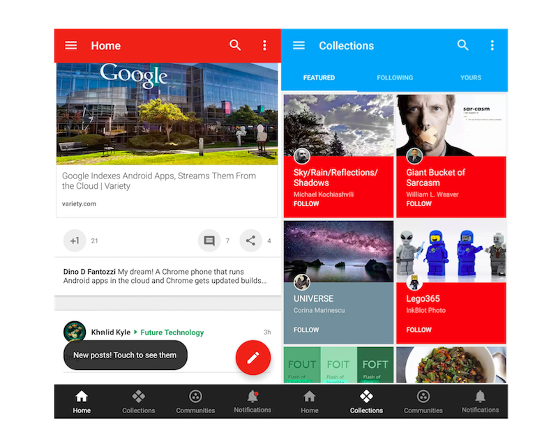
Earlier this week, Google announced that it is revamping Google+ social network with a focus on Collections and Communities. It now comes with a new, intuitive, and responsive interface that is also more consistent across devices and platforms. The company said that the redesigned interface will gradually roll out to all users, however, Web users had an option to manually flip the switch to see the new interface from Settings. The Android client of the social network was expected to get it in coming days, but it turns out there is already a way you can get the new designed interface.
The company has started to roll out Google+ v6.8 for Android, which features the redesigned user interface and comes with some new features. If you don’t see the updated app available for you on theGoogle Play, and are impatient to try it, you can install the Google-signed apk of the new version, viaAndroid Police. The new interface however may not be visible for everyone straight after the install, but those users unable to see it can simply delete their Google+ data on their Android device viaSettings>Apps>All>Google+. If it still doesn’t work, waiting for a server-side update may be your only option.
As you can see in the image above, the new Google+ interface for Android sports a new tab bar that pops up at the bottom of the feed. The tab has Home, Collections, Communities, and Notifications buttons. It’s a handy addition, as it makes it easier to navigate around the network, and check notifications. The settings are also arranged in a different order, and there’s a G+ activity log, too.
Collections and Communities are the two focused areas in the revamped Google+. The company announced on Tuesday that with these two sections, it aims to make it easier for people to discover things they like.
[“source-gadgets”]
